Danbooru
Login Posts Comments Notes Artists Tags Pools Wiki Forum More »
Listing Upload Hot Changes Help

Search

  • Help
guro
scat
furry -rating:g

Artist

  • ? yajirushi (chanoma) 562

Copyright

  • ? original 1.3M

General

  • ? 1boy 1.6M
  • ? 1girl 6.7M
  • ? blazer 80k
  • ? brown eyes 917k
  • ? brown hair 1.7M
  • ? gameplay mechanics 14k
  • ? glasses 406k
  • ? jacket 1.1M
  • ? necktie 507k
  • ? puzzle 603
  • ? school uniform 872k
  • ? short hair 2.5M

Meta

  • ? commentary 1.7M
  • ? translation request 619k
  • ? ↳ check translation 38k

Information

  • ID: 4199316
  • Uploader: MrSusher »
  • Date: over 4 years ago
  • Size: 1020 KB .png (1250x800) »
  • Source: pixiv.net/artworks/85631472 »
  • Rating: General
  • Score: 8
  • Favorites: 6
  • Status: Active

Options

  • Resize to window
  • View smaller
  • View original
  • Find similar
  • Download

History

  • Tags
  • Pools
  • Notes
  • Moderation
  • Commentary
Resized to 68% of original (view original)
original drawn by yajirushi_(chanoma)

Artist's commentary

  • Original
  • |
  • Translated
  • どんなに言葉を並べても

    言わなきゃ消えないんだから
    https://chanomach.fanbox.cc/posts/1589447

    落ちゲーですね。ただ、落ちゲーは同じ色を並べたり列を揃えたりすりゃ消えていくけど、言葉の場合は並べるだけじゃだめで、言わなきゃ残り続けるんだよ、消えないんだよっていう。
    思ったことをすぐ言えるやつと言えないやつの対比って感じですね。相手にもよるんだろうけど。

    年明けくらいの絵で落ちゲーの画面風になりかけたやつがあって、いや落ちゲー風やるならもっといいシチュエーションあるっつってやめた絵があるんだけど、正解だったかなって感じっすね。

    ■どこまでやる?手描き感
    字の話。今回の場合、ブロックに書かれている文字は手描き(同じ文字はコピペしてる)、ほかはフォントです。
    最初はブロックに書かれてる文字もポップなフォント使おうかとか思ってたんですけど、この絵って構成的にブロックに書かれてる文字は注目されることを想定してるので、そこがフォント感丸出しだとさめる人もいんのかなとか思っちゃって、結局手描きになりました。
    手描きとフォントが混じってると気持ち悪いかなとか思っちゃって一時はスコアとかの文字も全部手描きにしたんですけど、そうなると今度はゲーム画面っぽさが薄れてくる感覚もあって、この形に落ち着きました。このへんのバランスはいつも迷いますね。
    Source: https://chanomach.fanbox.cc/posts/1589447

    However I try to line up my words

    they won't vanish until I say them.
    https://chanomach.fanbox.cc/posts/1589447

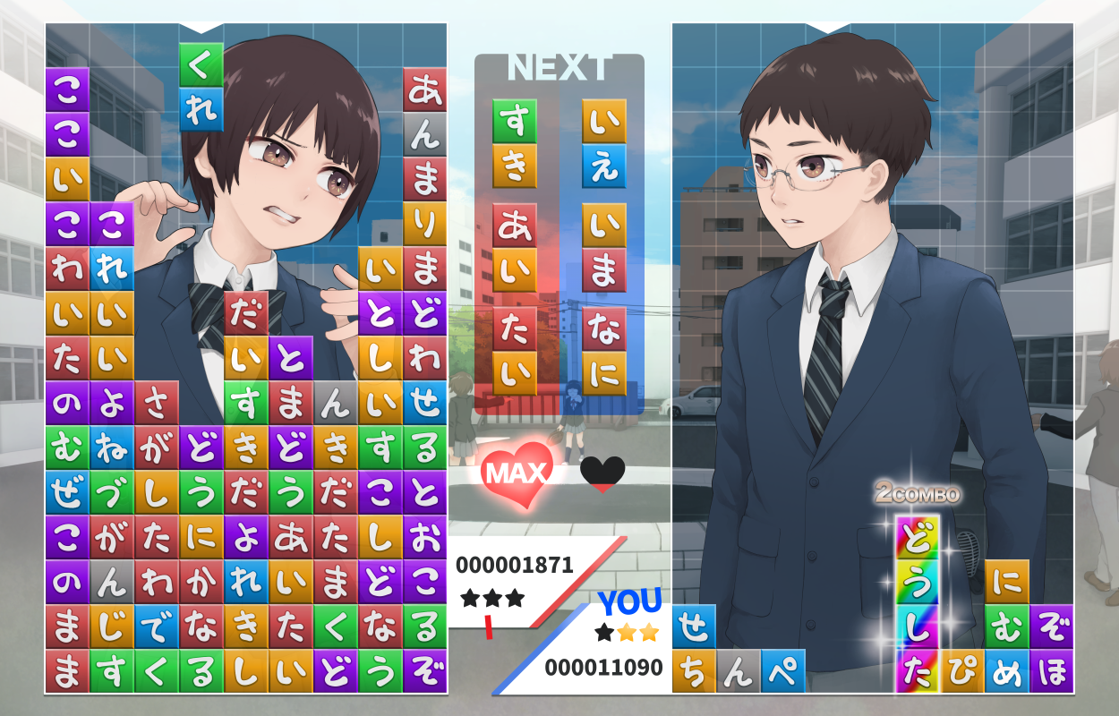
    Falling puzzle games, yeah? In those games, you can make a line of the same colour and it disappears, but when it comes to words, lining them up isn't enough. You have to say them or they'll keep staying behind, never disappearing. That's the idea.
    It's that contrast between the ones who immediately say what's on their minds and the ones that don't. It also depends on who you're talking to, of course.

    There was a falling puzzle game-ish drawing I made at the start of the year, but I told myself that if I'm going to make it falling puzzle-themed I should make it a better situation and gave up on it. It feels like I probably made the right choice.

    ■ How far do you go? Handwritten feel
    I'm talking about the characters. In this case, the text on the blocks is handwritten (and duplicates are copypasted), while the others are fonts. At first, I was thinking of using a pop font on the blocks as well, but going with the idea that compositionally, the characters on the blocks are what draw the eye in this picture, I figured people would criticise it if that text was all font-based and in the end I wrote them by hand.
    I thought mixing handwritten and fonts would look off-putting and for a moment I had the score and stuff also handwritten, but I felt that reduced the game screenshottyness of it instead, so I settled on this. It's easy to get torn up about the balance of things like these.
    Source: https://chanomach.fanbox.cc/posts/1589447

    • ‹ prev Search: user:MrSusher next ›
  • Comments
  • Recommended
  • Loading...

    There are no comments.

    Counting on you
    Dear
    A little
    right now
    Don't play with my feelings too much or I'll get mad
    Give me
    Scared
    Here
    Stunned
    I don't have one
    I love you
    Searched
    Love you
    Somehow or another
    Want to see you
    History
    You like this, right?
    Want to
    McDonald's
    What's wrong?
    The way we are
    see you
    No
    Terms / Privacy / Upgrade / Contact /